Boulangerie Django
Cubist bakery in Tokyo
JAPANESE ENGLISH
Boulangerie Django
Implemented in 2019
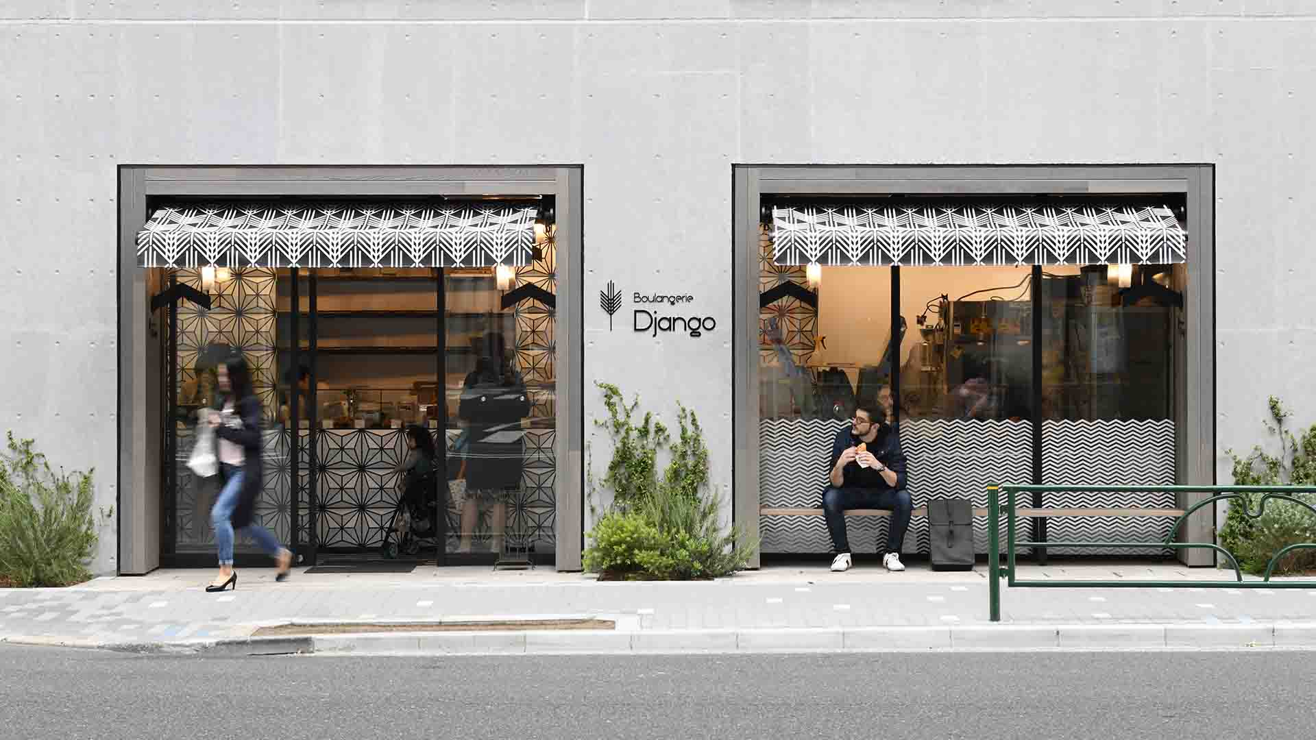
Boulangerie Django, a bakery themed after Czech cubist architecture.
Project by Toshihiko Suzuki (ATELIER OPA) and Takao Nishizawa (buldinglandscape)
3-19-4 Hamacho Nihonbashi Chuoku, Tokyo, Japan
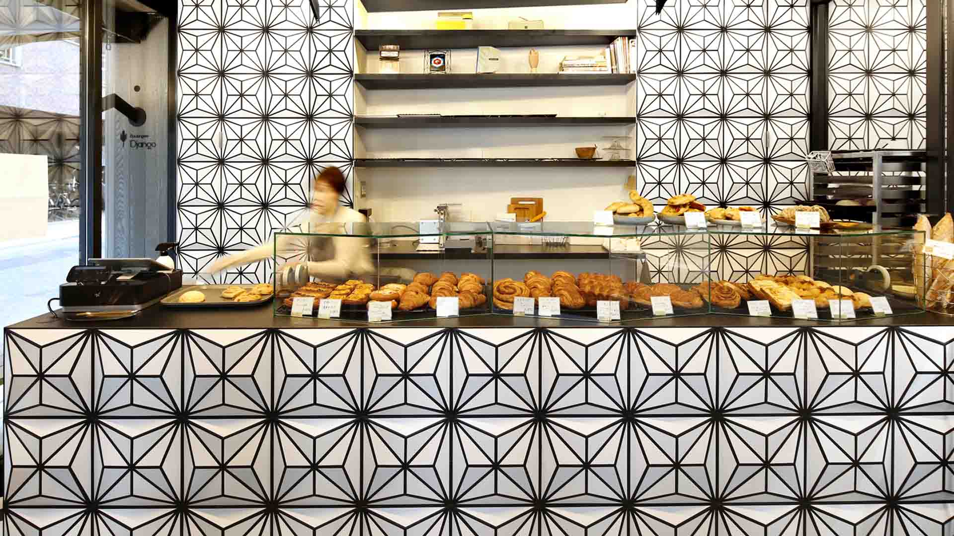
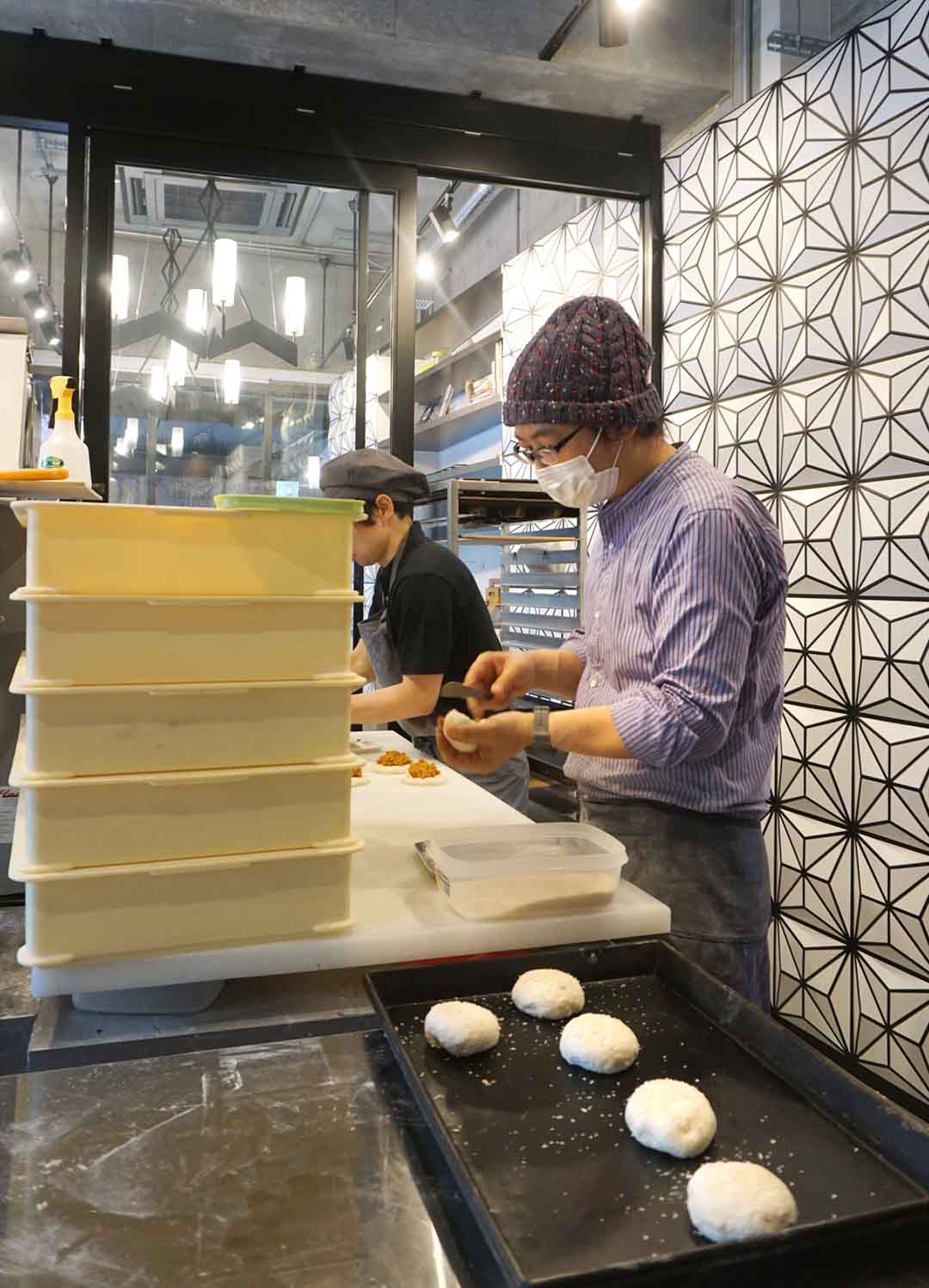
The bakery was placed on the left side and the factory on the right side. In order to maximize the use of the limited area, we designed the space with exhaust, flow planning and power.
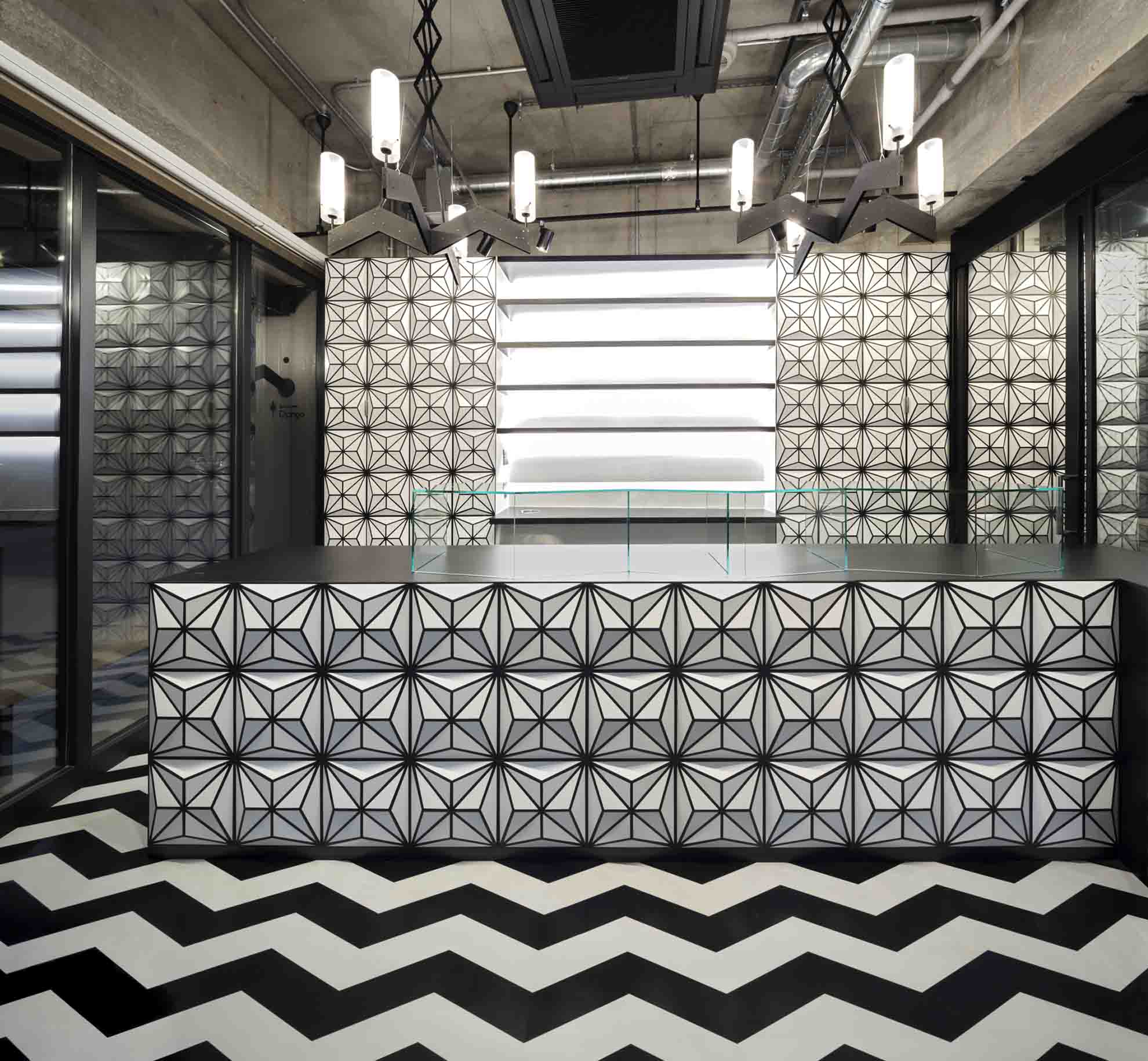
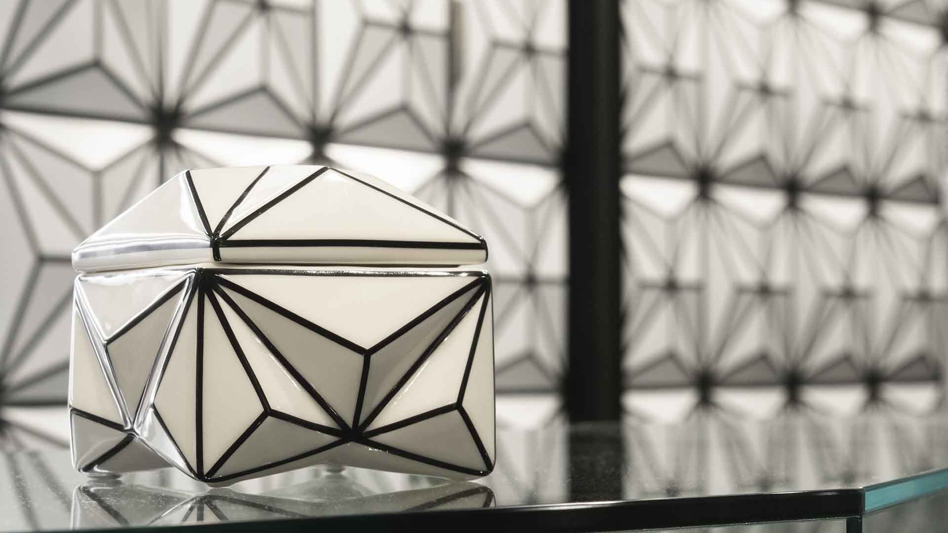
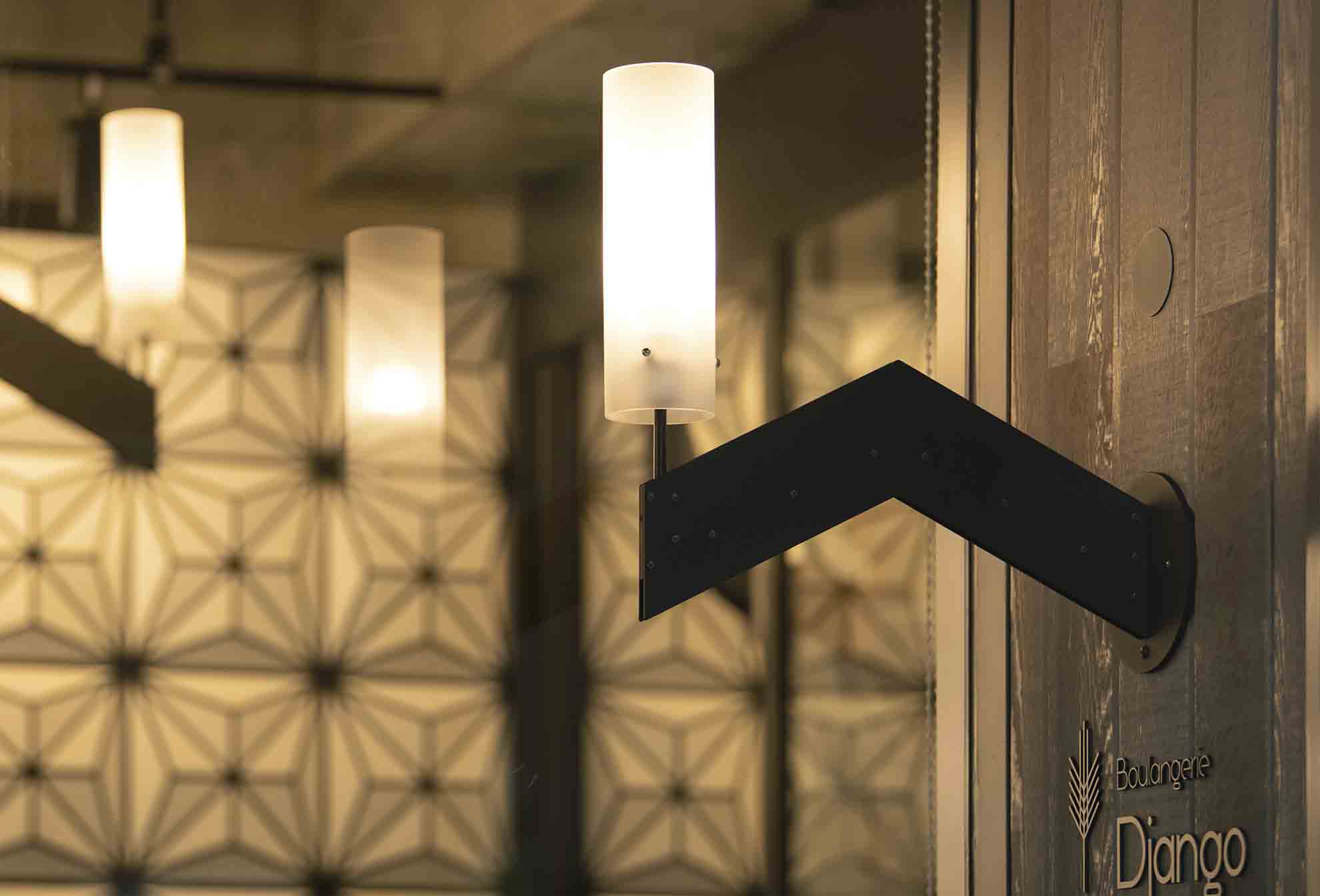
The motif of this wall is a ceramic crystal box designed by Czech architect Pavel Janák. The custom-made lighting was also inspired by Czech cubism.
Boulangerie Django was selected to shortlist of interior section of the Sky Design Award 2019 and was presented an Honourable Mention certificate of 2020 Golden Trezzini Awards 2020.
To seek a new image of a bakery store, we visited the Cubist buildings in Prague, Czech Republic, with an owner-chef couple. We desire to shed more light in Tokyo on the cubism style that can only be seen in Prague. Thus, our vision has crystallized into an artistic cubism bakery that adorns the street corners. A popular bakery, Boulangerie Django, moved from Ekoda and opened on the first floor of a social apartment in Nihonbashi-Hamacho in Tokyo, where the area development is set in the city of Kabuki theater, a symbol of tradition and modern style. We designed a new distinctive shop using some geometric patterns.
The central theme came from Czech cubist art, which originated in Paris and became popular in Prague from 1911 to 1925 in architecture and product design. Before the construction, owner-chefs and architects traveled together in Prague and studied cubism architecture variation to express their identity as an independent nation. As a result, the shop's interior, the wall, and the showcase's front were covered by three-dimensional panels with enhanced geometry. These 134 panels with steel plate welding have a Crystal Box ceramic motif designed by Czech architect Pavel Janak in 1911. The floor was then made using inlaid hard rubber, and wavy lines decorated the lower half of the glass facade. The awning was designed by a running pattern of wheat used as the bakery logo since its establishment in 2010. V-shaped steel lightings were also specially made. These enhanced geometric patterns and united a shop space with a factory space.
Thus, the unique bakery shop attracts passengers' attention, and the bread carefully made like a craft, satisfies their appetites. So far, most bakery shops in Japan have followed the style of France. The owner-chefs always traveled to Paris every year to study the latest trends and tastes. However, the focus on Prague made a big difference in the design of the bakery shop. A unique expression of space where movement, light, shadow, and curiosity has become the city's talk. Moreover, the geometric design of the shop reminds us of Japanese historical design. So we concluded that the success of cubism in Tokyo is an appropriate way to express the reopening of a bakery with an international style. This artistic shop located in the corner contributed to the city's exciting atmosphere with an original touch.

Awards
Sky Design Awards 2019 Interior Design Shortlist
Golden Trezzini Awards 2020 Honourable Mention
© ATELIER OPA Co., Ltd. All rights reserved.